In the common parlance of campaigns a Universe is the set of voters who will be sought via a given contact means. For instance, a “text universe” is the list of people you text, while a “call universe” is the list that gets cut up for your phone banks. A “direct mail universe” is what it sounds like, and is itself a tremendous budgetary decision for campaigns. Scoping the sizes of these universes, as well as wisely selecting their contents is an important strategic task for campaigns.
New technical platforms are continuously emerging and voters are being met there. This has increased the burden on campaigns to maintain multiple universes. Often, these universes begin to really diverge from each other too, as they were purposed differently, and are given differing levels of budget and attention–and they are often managed by different people and teams.
Before the introduction of ranked choice voting in NYC, we typically produced up to 6 different universes for campaigns through their life-cycles, for uses across various channels:
Deep Canvass Universe
Survey/Petition Universe
Mail and/or Postcard Universe
Voter Identification Universe
Voter-ID Expansion Universe
GOTV Universe
These universes are selected from a recent voter file, after a consultation on its purpose.
Our continuous integration of these universes allows for efficient and optimal voter contact, while minimizing waste and voter fatigue as well. This is a phone model that will drop a voter if someone reaches them at their door, and vice versa, or a postcard universe which is populated by anyone who was not reached in two successive phone calls.
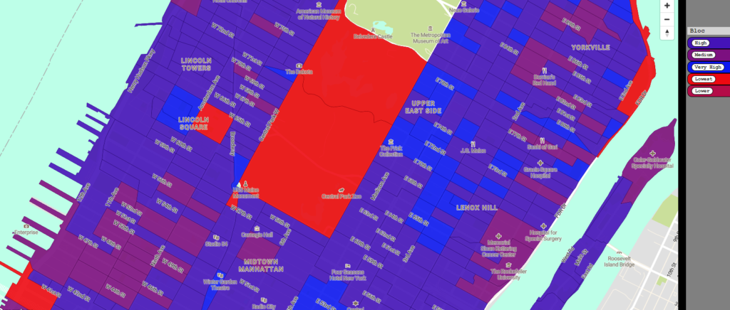
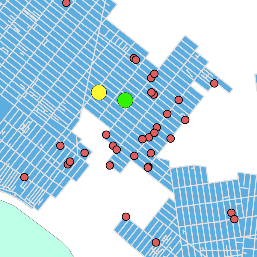
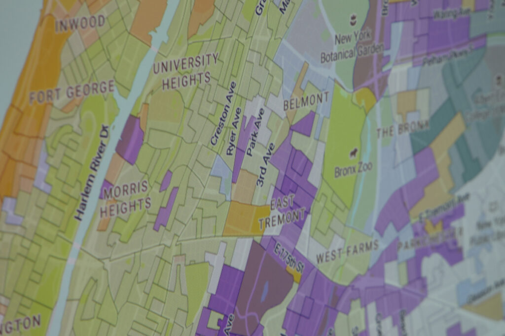
We also help campaigns to be maximally extractive within their supply of registered voters. This is a specialty service we provide for campaigns that want to be especially aggressive. One of the ways we have been doing this for years is with bespoke cartography and GIS.
In this research map, we identified the mean and median location of voters within a weirdly-shaped district. Also indicated with red dots are the fixed addresses containing more than a certain number of Registered Democrats. This kind of work is done with a geocoded voter file.
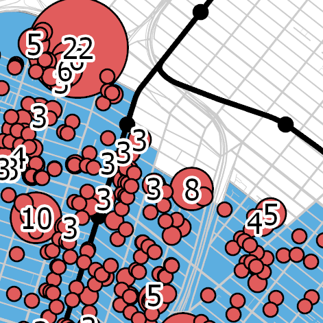
We can also indicate magnitudes of voter quantity, even situating voters in context of Transit Points of Interest like subway stations and stops. This can be incredibly useful when designing public visibility events as well as canvass targets.
While several products dominate in their respective lanes of voter contact, we believe that designing really powerful input, and also integrating what a campaign is capturing via these systems can be essential to out-performing the competition. We believe in universes that continuously remodel themselves as a byproduct of your voter contact activities, to which you are already directing vital resources.
Who is going to turn out for a municipal election held in an off-year, in an off-brand month, in the immediate aftermath of the 2020 election, and under conditions of a pandemic? That is the question we seek to answer with Turnout Modeling.
For starters, and even before accounting for the new world of Ranked Choice Voting, a turnout model is necessary to begin approximating a Win number and various objectives along the way. This is not an exercise in who will be casting the votes, but in where votes in what quantity should be found. To us, there are two processes to turnout modeling, neither is perfect, and it is best to combine both.
First, we take in turnout figures at the Election District (ED) level for numerous election contests held in the area. We build our historical trend-lines at the Assembly District (AD)-level at first because EDs periodically change from cycle to cycle. This is working with tallies of votes that were counted, from certified election results.
Next we go into the Voter File, where voter history gives us a propensity of (a voter, a group of voters, a turf of voters) to participate in a given election or cycle. Though we do not know with certainty what ED these voters resided in at any time in the past, we do know where they are now and that is all that matters. We are building up counts of voters of a given propensity to vote, and can begin tallying them by our current districting at the ED level.
And then we bring in our Confounding Features, otherwise known as the political topography. For instance, a contest may feature an incumbent or not, and have strong endorsers or heavyweight cash–but maybe not. We also check trendlines on how local legislators in other lanes are performing relative to the tops of recent tickets, such as Biden and Cuomo, because this is where we begin to squeeze out ED-level insights that are current. In some parts of NYC, you are running against the Mayor more than in other parts, even within your own party. We have a sensitivity to this, but frankly, so does the data.
Our turnout models let you get past the hype of what your coalition ought to be, and into the specifics of where it will come from. When output on a map, our turnout models can help you figure out which neighborhoods to prioritize (and not) quickly.
Here are just four features of political topography which we consider when producing a local turnout model:
1 – The “attack” and “decay” as voters enter and leave the count between Primary and General elections of the Presidential, Gubernatorial, and Municipal cycles, when controlling for interest in the contests. For instance, the 2017 municipal election was very low interest, but the presence or clumping of people who turned out for it is important to our modeling effort. This is a window into local organizing strength and interest. This election will feature much more interest, with lots of open seats and a big ballot. All of these factors tug in different directions.
2 – The “relative performance” of various incumbent Assembly and Senate members, when compared to each other and also when compared to top-of-the-ticket interest such as Biden and Cuomo (or Sanders and Nixon). Where these leaders run strong, their apparatus will contribute to turnout. These factors help us “trade-weight” how we interpret some of the other measurements and derived statistics we are making. If an Assembly Member runs well ahead of Biden when they appear on the ballot at the same time, this is a good proxy for local organizing strength.
3 – The propensity–at the ED level–for voters to use mail-in/absentee ballots. This is the COVID-special, and our analysis of where these products are used as opposed to a heavier reliance on voting at the poll-site has proven terribly interesting (to us, anyway).
4 – Roll-off–We examine how far down the ticket voters tend to go in each area. This can be vital if your campaign is not at the top of the ticket. We measure how much resistance there is to voters traversing the ballot on your turf. This can be done by counting how many votes for {President, Senator, State Assembly, State Senate… or Mayor, Public Advocate, Comptroller, BP, DA, City Council,DL,…} are historically cast in the same places at the same time.
I believe that any good campaign should actually be looking to increase turnout over its own turnout model. If the turnout model itself is sound, your ability to increase turnout would be a measure of your campaign’s effectiveness. Also, if your opponents have sound turnout models but are not engaged in increasing turnout as well, you seize some advantage when you do it.
Previously, we described our FEC research into itemized donations by individuals to campaigns for House, Senate, and President, and which were filed during the calendar year 2020. The map we demonstrated in that post is in a style we call “king of the hill” in that it shows you the winner between different lines within a precinct. Ideal for election returns, it reflects competition and the magnitude of the marginal win itself is encoded in the shading. For those maps, we only showed you ZIP areas where both Democratic and Republican giving was found, in order to hide baseline noise and highlight contrast.
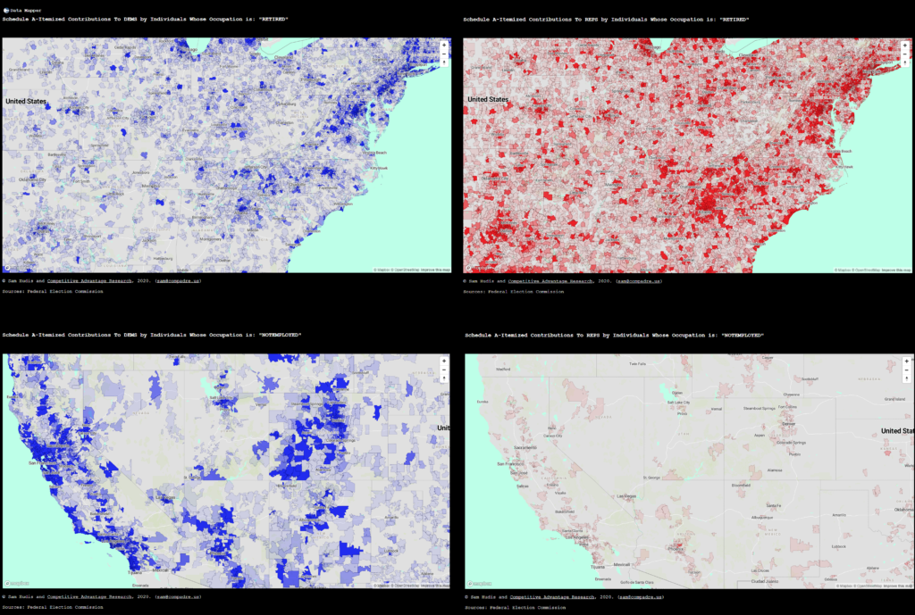
Here is a different mapping style indeed, where we separate partisan giving, and compare the local magnitude of each. The top pair of maps are for the occupation of “Retired” whereas the lower pair are of the term “Not Employed.”
Though these mean fundamentally similar things, each occupational term has a markedly partisan cast to it.
Here is a pair of maps reflecting a detail on the political giving by donors who list their occupation as CEO. You might not be surprised to find this, but after terms that refer to non-work, CEO is currently measured as the largest-spending occupation in the Federal system, in 2020.
The GOP candidates took $39,342,528.57 in CEO money, nationwide.
The Dem candidates took $34,724,691.72 in CEO money, nationwide.
What we’re doing to display magnitude here is a process known as quantization which is where we control how our data values (dollar sums, in this case) are symbolized to viewers. For instance, Democrats are blue and Republicans are red. But we also shade the opacity of each area in a way that maps to the underlying value–this highlights the gradation in values, illuminating where the big money is in these maps.
Attorneys are $179,770,993.86 Democrat
Attorneys are only $25,268,941.30 Republican
These two maps share a feature: quantization. Because they have the same quantization, it is easy to see the partisan influx of attorney money to Democrats, relative to the ghost-town of GOP-supportive attorneys. If these maps were quantized based on their own local values, they would not be comparable to each other, but since they are uniformly quantized–like having the same y-scale on a chart, these may be compared side by side to study impact. However, this blog may be breaking the news that the legal profession preferred Democrats to Republicans 7 to 1 in context of their 2020 political engagement.
These techniques let us find another place where that is totally true.
Physicians gave $16,750,211.96 to GOP candidates
Physicians gave $59,386,824.50 to Dem candidates.
The medical profession preferred Democrats over Republicans 3.5 to 1 with their political engagement in 2020. It’s almost as if… nah.
These maps are recommended for systems with a good download speed and adequate memory. Share and enjoy!
Everybody in politics has an opinion about ranked choice voting; our perspective is that RCV is good and lawful because voters want it and we are glad that it is in play. Beyond that, my own opinion is one of skepticism. Not in the sense of thinking “this will be bad” but skepticism in the sense that I am constantly thinking about how we don’t know what immediate impacts RCV will have–beyond the rhetorical ones. I would like to test and prove all of the various claims when it is employed. It will offer a flourishing of campaigns and strategies, and to me, it may be that this is neither good nor bad. Given that we do strategic computation as a business, we think it is good.
Click here for an explainer of how the system will work for NYC, and the main thing you need to know is this:
“In New York City, primary and special-election voters will have the choice to rank up to five (campaigns). So let’s say you like Candidate C the best, but you also like Candidate A and to a lesser extent Candidate B. You can rank Candidate C as your first choice, Candidate A as your second and Candidate B as your third. You don’t have to rank all five – in fact, you can just choose one candidate.”
Let’s consider the concept of “voter roll-off” right as we jump in. This is the phenomenon where a voter casts their ballot, but they do not input a choice for every single contest featured on the ballot, leaving some rows under-voted. While much formal work has been done in an attempt to understand voter decision-making patterns, roll-off–whether it is encountered in “down-ballot” races with low awareness or is done intentionally at the top of the ticket–is known to occur for a variety of reasons.
Voter roll-off exists in a new dimension now as well. Consider voters who show up and vote in your contest but they select only one candidate, providing no further ranks at all. Undeniably, anyone who cast a vote in the election has preferences for the outcome, and the new vote-counting system provides additional depth for encoding these preferences. In a way, you could say that this voter is leaving part of the activity on the table, and they have diluted the strength of their own vote merely by failing to rank 2nd, 3rd, 4th, and 5th-choice candidates (where five or more candidates exist) when other voters are doing so to the benefit of their own preferential outcomes. Put simply, when looking at the complexity of turnout in these elections, we not only have voter roll-off on the ballot vertically, but now there is a horizonal form of roll-off.
I started with the concept of roll-off here for a simple reason: let’s say you have a crystal ball and it tells you that 10,000 voters exactly will ballot in your hypothetical contest. In the past, the objective floor for your “Win number” would be 5,001. The contest has begun and there are ten (10) candidates. Now, for simplicity’s sake, let’s suppose that your crystal ball also tells you that these 10,000 voters are all high-information, duly motivated citizens, and they will all cast the full width of the ballot–assigning all five available rank slots to candidates.
You just collected 50,000 votes. What is your win number now?
At this time, nobody has any proven notions about how NYC voters–in a town with storied neighborhood Clubs, union bosses with real political power, and aggressive tech-sector companies doing intense local politics and lobbying–will react to RCV or appreciate its rankspace. Votes could be said to be hugely inflated–there’s so many of them now!–and they fill this rankspace in a way nobody is situated with yet.
When I say rankspace, I mean that rather than recording the vote as a single candidate name or line, voters are ranking preferences and presenting vote-counters with an ordered list. This is literally a new data-type. Your win number doesn’t automatically become 25,001 if you collect 50,000 votes from 10,000 voters in this format.
On a typical 10-candidate ballot, for all voters that took part, there are exactly 10 possible ballot inputs the government will receive from the hypothetical 10,000 voters. A vote for you counts as a vote for you, and 5,001 is everybody‘s objective win number. Everybody must pursue the same licit strategy: connect with 5,001 or more voters. While there is no crystal ball in reality, and turnout is forecast rather than known, the basic practice here is the same–set a target that will end up being the most votes cast. Being less wrong about turnout and also achieving reasonable and achievable targets for your win condition is the thing itself.
I have been conducting an informal survey of NY-focused political professionals for the last few months and asking them whether they are planning any changes to voter contact scripts or to their data collection practices in context of RCV and I am stunned that to date, nobody has anything special in mind.
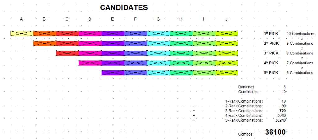
The New Ballot Preference Combinatorics Under RCV
This visualization represents an algorithm we have written to express how many voter preferences might exist, with a given number of candidates. We start here because we believe that approaching a win number and understanding your proximity to it under RCV means understanding the formation of voter preferences in some new dimensions.
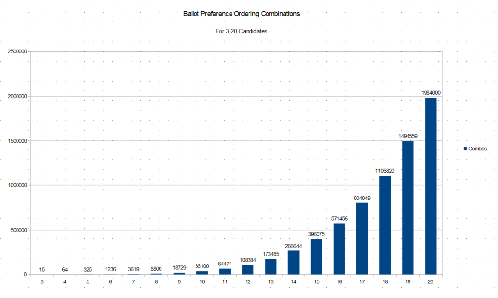
What you can see above is that if there are 10 candidates standing, voters may submit ballots any one of 36,100 ways. That number is correct. Here is a sense of how this plays out as you grow the height of the ballot, adding candidates in your contest and this does not include the potentially limitless variety of write-ins:
Even with just three campaigns in place, there are now 15 ways voters may submit a ballot. Here is how ballot combinatorics works now for 3 campaigns (which are herein called A, B, C):
1st
2nd
3rd
1
A
B
C
2
A
C
B
3
B
A
C
4
B
C
A
5
C
A
B
6
C
B
A
7
A
B
8
A
C
9
B
A
10
B
C
11
C
A
12
C
B
13
A
14
B
15
C
“Horizontal roll-off” shows up in row 7 onward.
Let’s take the perspective of Campaign A. We have the crystal ball and expect 10,000 voters. Because this is a 3-way race, we will actually be able to discard the third round picks entirely, and work in two rounds, with certainty. Few will be this lucky, but I’m going with this to demonstrate these concepts in their plainest forms. What this means is that we are only going to address the last 9 rows of the table above–where two-round preferences are entered–as our meaningful ballot combinations. That is the rankspace for the topology of this particular contest.
Out of 9 combinations, ‘A’ is the pick in 3 of them. We might start by assigning first round probabilities to each candidate. Let’s say A, B, and C ran very close to each other near 33%-up, and we definitely need to use second round votes to address the winner. With a nail-biting first-round, we are now deciding the race on second-ranked votes. Suppose that by a little bit, C is the first to drop, and we are in the race for being the second choice pick of C-voters.
What information are you storing about where or whether voters are encoding preferences found in the ballot combos from lines 11 and 12 in the table above?
11
C
A
12
C
B
“Though I’m leaning, leaning to the right I support the left”
After all, these voters are about to ultimately determine your election in the new rankspace; it will not be decided by the voters who picked you and/or B first, though they lifted you into the second round. Which ballot combination will be more prevalent? Which type of voter will turn out in greater force? When do you want to find out? Are you involved in this process?
For instance, this hypothetical was based on A meeting B after C drops in the first round. Why was it C that dropped? Perhaps A would prefer if B dropped first so they could meet C in round two, because the distribution of…
B
A
B
C
…is more favorable to Candidate A. This knowledge could impact how A engages with B and C as well as their supporters during the campaign. If you let it.
If a campaign has ten candidates (A-J) but is definitely soluble on the second round, that’s a mere 90 ballot combos to confront. It grows to 720 when a third round is needed, however. Exactly how gritty do you intend to get with understanding coalition formulation on your turf?
Most people in the trade say that the instructions they give is when you encounter a voter who is not with you, you remove them from the universe. We’d like to help you rethink that.
When making contributions to Federal candidates for office (House, Senate, President), donors are asked to list their occupation as well as their employer. This allows committees to meet their own compliance burden to report such information to the FEC.
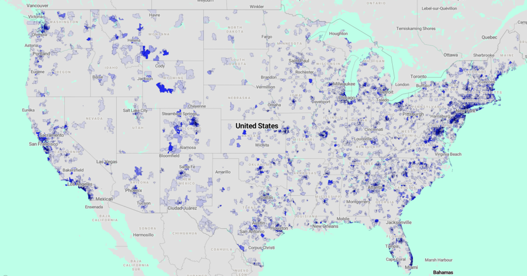
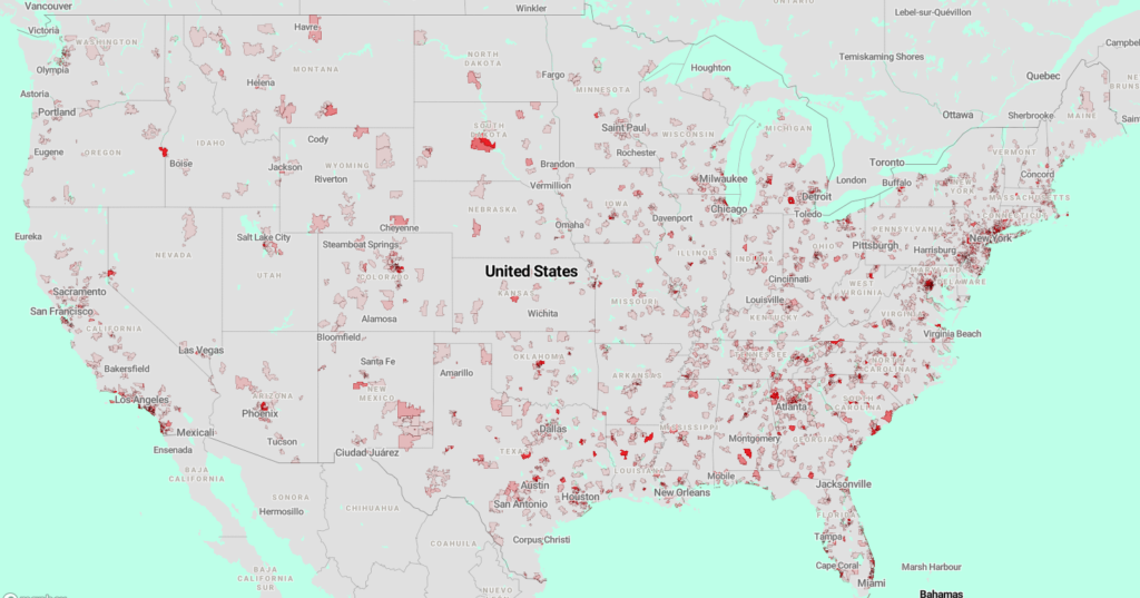
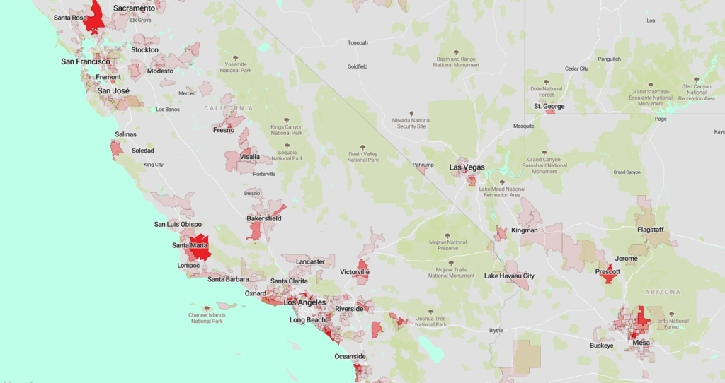
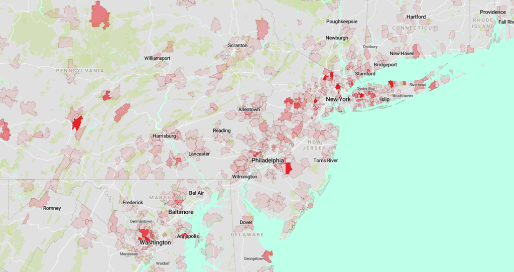
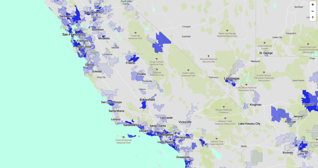
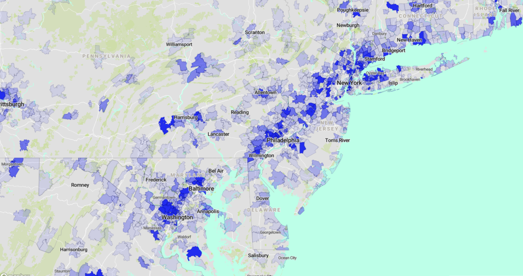
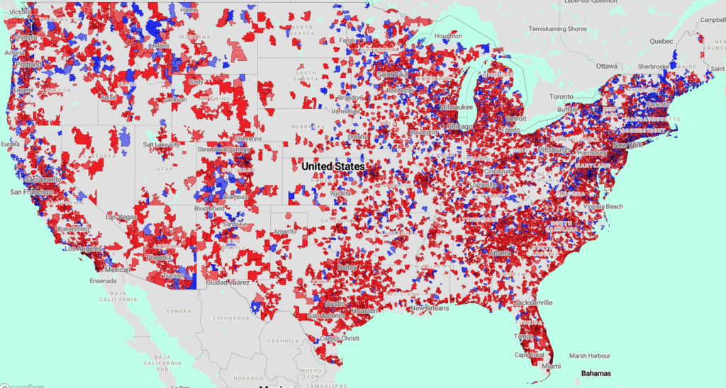
Our research of Schedule A Itemized Contributions by Individuals (more on entity-types later) to Federal candidates that were filed electronically in 2020 reveals that one of the top-ranked occupations for donation in this space is retirement.
We tabulated by ZIP code in every area where giving was found for both Democrats and Republicans and we found $522,029,538.87 in donations filed under Schedule A documents from people who described their occupation with just one word: “RETIRED.”
That’s half a billion dollars filed in 2020 as contributed to Democratic or Republican candidates for House, Senate, and President–by retirees. What’s more: this donation has a partisan tilt that actually might not surprise you at all. 60.82% of this source of cash went to Republican candidate committees, whereas 39.18% went to Democrats, an edge of roughly $110,000.00.
A screenshot (detail) from DataMapper by Competitive Advantage Research: Schedule A-Itemized Contributions by Individuals Whose Occupation is: “RETIRED”
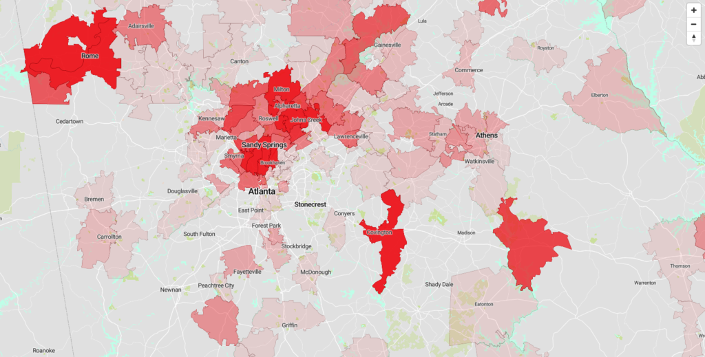
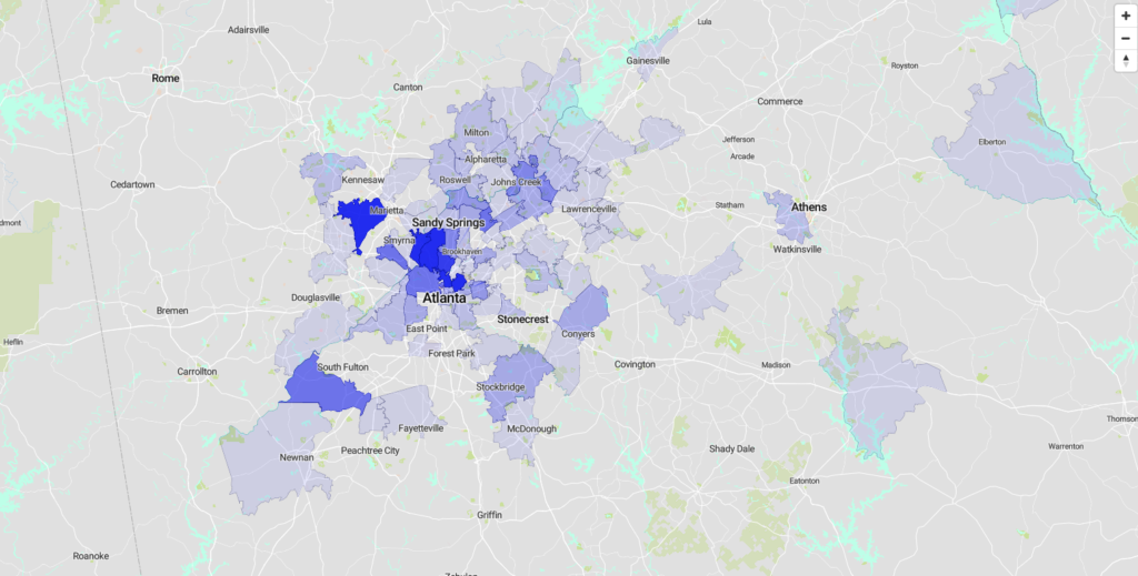
In the map presented in detail here, we are displaying ZIP codes with bipartisan giving, and shading each area based on which party’s candidates received the most cash in that area. The opacity in each area relates directly to the share of cash: if Republicans raised 51% of the cash in an area, you will see a 51% opaque red. If Democrats raised 80% of the cash in an area, you will a 80% opaque blue. Where you see no shading, it means that we did not find giving to both parties. We leave these areas out as a way to provide greater contrast on contested turf, generally.
Doing this kind of thing can be interesting, especially when it is time to wade into a purple state and you want to build up a highly specific and local understanding of where to bring the fight.
A screenshot (detail) from DataMapper by Competitive Advantage Research: Schedule A-Itemized Contributions by Individuals Whose Occupation is: “RETIRED”
While retirees may not comprise a special interest group, knowing where they are and what they care about may be a helpful part of building a turnout model, designing targeting for a voter universe, or extending your voter contact apparatus. Also, “Retired” is just one occupation we’re going to look at.
A screenshot (detail) from DataMapper by Competitive Advantage Research: Schedule A-Itemized Contributions by Individuals Whose Occupation is: “RETIRED”
The interactive map screenshotted here is available at national scale for you to play with in DataMapper by Competitive Advantage Research but with this caveat: it is very big in two ways. There is a large data file downloaded and it consumes a lot of memory (RAM) when loaded into your browser, but if you have a decent enough computer and connection, you’ll do fine if you click for this map here.
If you have something you’d like to map, or anything you’d like to know out of our special data warehouse of FEC-regulated committees, get in touch.
A screenshot (detail) from DataMapper by Competitive Advantage Research: Schedule A-Itemized Contributions by Individuals Whose Occupation is: “RETIRED”